Logo and website design for Motorhome Camp
We recently had the exciting opportunity to work alongside Motorhome Camp, a family-run motorhome broker and seller, on their logo and website, helping to kick this fresh venture into fifth gear straight out the gate by designing attractive, meaningful brand assets.

Much like the website we created for Love Southsea before splitting their site into two separate parts, we designed the Motorhome Camp website to fulfil two drastically different objectives. Just as the Love Southsea website served merch shoppers and event traders, the Motorhome Camp website exists for both sides of the buying/selling coin. We designed the website with this in mind, ensuring both halves of the target demographic find every page accessible, legible, and interesting.
Atop the website — which is, naturally, totally responsive across all platforms — is the logo we created for Motorhome Camp. And would it really be a TLMedia logo if there wasn’t some visual punnery? The ‘O’s in ‘Motorhome Camp’ are formed by the three sets of wheels cutting into the illustrated vehicle’s chassis.
That chassis started out quite blocky and square in the first complete concept art:

This looked a little too American, so I switched up the aesthetic for something a touch more modern and curvy:

And thus, the final logo:
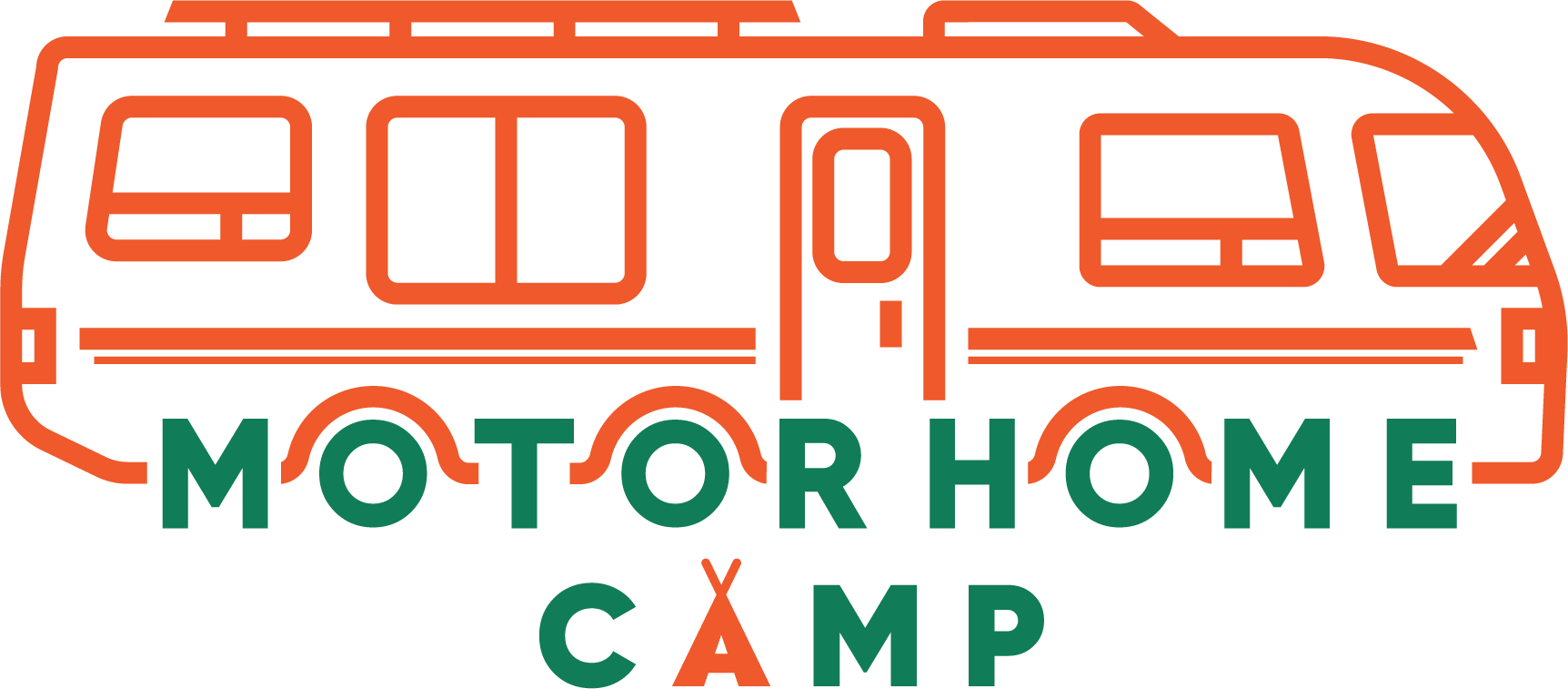
A good way to add a sense of detail to a logo that’s just thick lines and typography is to throw in a thinner stroke somewhere. But be clever about it. Example: mirror the divergent stroke weight by mirroring it in a second place, a la the motorhome livery matching the tentpoles.

It’s a sharp, potentially timeless mark which we’re excited to see Motorhome Camp use in abundance. If you believe your business could benefit from an identity change, get in touch today!